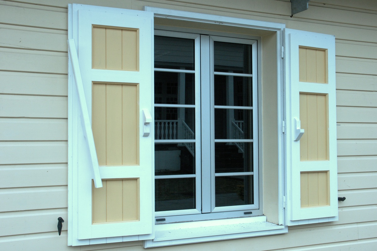
Window color is one of the most important choices you will make for your home. The color you choose affects curb appeal, how well your home fits with its surroundings, and even how much light and heat pass through. A smart choice adds value and reduces the chance of costly changes later.
Below, we explain the key points to review before making your decision. You will learn how color impacts style, energy use, and long-term maintenance so you can choose with confidence.
Why Window Color Matters for Kansas City Homes
Color frames the way people see your house. It can lift curb appeal, help resale, and tie the roof, siding, and trim into one clean look. Color also changes how heat moves. Dark frames absorb more warmth. Light frames reflect more sunlight.
In our climate, with hot summers and cold winters, the right choice can support comfort and energy savings. Good color also hides dirt and wear, which keeps your home looking fresh longer.
Key Factors to Consider Before You Choose
Look at Your Home’s Existing Palette
Start with what will not change soon. Note your roof color, siding color, stone or brick, trim, and front door. List the tones you see: cool grays, warm tans, bright whites, or deep browns. Pick a frame color that supports the main tones instead of fighting them.
Balance Trends with Timeless Style
Trends come and go. We suggest a look that feels current and still fits in five or ten years. If you want a trendy accent, use it on the door or shutters. Keep frames classic so you do not regret the choice later.
Match Function to Your Life
High sun on a wall can fade paint faster. Kids and pets can leave marks on light frames. In busy zones, darker finishes may hide wear better. In shaded areas, lighter frames can keep the space from feeling heavy.
Check HOA or Neighborhood Rules
Some areas limit frame colors or sheen. A quick check now avoids a slow approval later. We help clients read rules and submit simple samples when needed.
How Architectural Style Guides Color Choice
A home’s style points to smart choices:
- Craftsman: Warm browns, earthy greens, or soft cream fit natural trim and gable details.
- Colonial: Crisp white or black pairs well with simple grids and symmetry.
- Ranch: Tan, bronze, or soft gray blends with brick and low roof lines.
- Modern: Black, charcoal, or pure white sets sharp lines and large glass.
- Farmhouse: White or very light beige with black accents gives a clean, classic look.
If you are unsure, we can hold sample frames against your siding and trim so you can see the match in real light.
The Role of Climate and Sun Exposure
Here in Kansas City, the weather is tough on windows. Hot summers bring strong sun that can heat up darker frames, while cold winters test the seals around them. South-facing walls get the most sunlight, which can speed up fading and raise indoor temperatures. On the other hand, lighter colors reflect more heat and stay cooler over time.
When we guide customers, we always look at how the sun hits each side of the house. If you’ve got full exposure, we suggest frames and coatings built to resist fading and warping. Pairing them with Low-E glass helps control heat gain without losing natural light. We also focus on proper sealing and flashing during installation so the finish stays protected season after season.
Comparing Window Materials and Finishes
Vinyl, fiberglass, and wood-clad each handle color in different ways.
- Vinyl: Color is part of the material or a laminated film. It needs little care and resists peeling. Dark vinyl should be engineered for heat so it does not warp.
- Fiberglass: Tough and paintable with factory coatings that resist fade. It holds shape in heat and cold.
- Wood-clad: Real wood inside, protective exterior outside. You get rich looks with durable, baked-on coatings. Plan for basic upkeep over time.
Ask how your window color is applied at the factory and what the finish warranty covers for fade, chalk, and peel. This tells you how the frames will look after years in the sun.
Popular Frame Colors and How to Use Them
White and Off-White
This is the classic choice. White frames look clean, pair with almost any siding, and add sharp contrast to darker roofs. They also work well with red brick or stone, which makes them one of the safest options if you plan to sell your home in the future.
Gray
Gray is flexible and easy to live with. A light gray frame blends into cooler palettes and keeps the look soft. Charcoal adds a modern touch without the full boldness of black. We often suggest gray for homeowners who want something neutral but not plain.
Black
Black frames make a strong statement and look sharp with modern homes or large glass areas. They outline the windows and give a polished finish. If you have full sun exposure, we recommend pairing black frames with high-quality coatings and Low-E glass to manage heat.
Brown and Wood Tones
Warm tones like brown or simulated wood grain are a natural fit for Craftsman and rustic homes. They tie in well with cedar siding, brick, or stone and help create a comfortable, earthy feel.
Tan and Beige
Tan and beige frames are soft and subtle. They let other features, like trim or siding, take the spotlight. We use them often on homes where the goal is smooth, quiet lines rather than contrast.
Green
Greens like sage or olive feel steady and traditional. They pair well with cream trim, stone accents, or natural surroundings. This is a good way to bring a little character to your exterior without overwhelming it.
Red
Red frames are bold and best used as an accent. They can add life to a front bay or special feature window, but we suggest testing them against your siding and roof first to make sure they complement, not clash.
Blue
Blue frames, especially in slate or navy, have a calm and fresh look. They can bring a coastal feel to a home or serve as a modern accent when paired with light siding.
Before you order, step back 30 feet and view samples in the morning and late daylight. That is when tone shifts are easiest to catch.
Advanced Design Tips
Create Contrast with Dark Neutrals
Dark frames against light siding add depth. Use charcoal or bronze to outline shapes and draw the eye to good details.
Add a Pop of Color
Choose one area to highlight, such as a bay or a front set of windows. Keep the rest neutral so the pop reads as a feature, not clutter.
Use Beige or Tan for Soft Lines
If you want a quiet, unified face, beige or tan frames blend into light siding. The result is calm and clean.
Mistakes to Avoid
- Chasing a fad that clashes with your roof and trim.
- Skipping real-world tests with samples and daylight.
- Ignoring finish and fade warranties.
- Forgetting how hardware color and grid style affect the final look.
Why Work with Energy Pro Windows
We guide you through every step, from quick window color mockups to material and glass choices that fit our climate. We install premium brands, including Joyce and Sunrise, with proven finishes and strong warranties. Our crews focus on neat work, proper sealing, and clean lines, so your frames look sharp and last.
If you want help picking the best window color for your home, contact us for a free in-home consult. We are ready to meet, measure, and provide a clear proposal.


